- We take your business to new heights
- support@growmybusinessonline.com.au
Elements of an Affordable Web Design

User-Friendly Website: The Collaboration of Web Design and SEO
September 8, 2020
Elements of a Mobile-Friendly Web Design
September 23, 2020It’s all about web design. If you are a business owner in Sydney, your website is absolutely one of the most important tools you have in your arsenal to get more – and better – clients and customers and grow your business online. So what separates a good website from a bad website, or a good one from a great one?
Unlocking a robust design for your new or existing website can seem like a magical process of transformation, creation, and combination.
The design of your website, much like the mysterious recipe for gold, is a complicated, mysterious, sometimes infuriating process — that is worth getting exactly right.
Web design is more than just visuals and aesthetics; it also affects your SEO and rankings, powers your audience’s perceptions of your brand, and influences your visitors’ behaviours. Your site’s design and layout affect your entire web presence.
Here are some of the elements of eCommerce website design that are must-have for any progressive online business.
Elements of an Affordable Web Design
1. Overall Layout and Visual Appearance
First impressions are critical, so you want to wow your audience as soon as the page loads. Users take only 50 milliseconds to form an opinion of your website or business, and that will determine whether they’ll stay or leave.
It means your design should align with a handful of soothing adjectives: it should be simple, familiar, intuitive, clean, accessible and don’t forget, Use plenty of whitespaces.
2. Website Navigation and URL Structure
The website design should be easy to navigate and the menu items should be easily accessible from any page. The viewer should always know exactly where they are on the website and have easy access to where they would like to be. A site map is a great idea and will be used if available.
3. Visibility of Vital Information
Not all visitors to your website are interested in, or have the time to peruse the entire site. They may need to access only a phone number or address, or just a certain bit of info. For this reason, itʼs important to place key information in plain site, in an area thatʼs easily accessible.
4. Website Color Scheme
As for choosing a colour scheme, paying attention to your brand or industry perspectives — along with your target audience demographics — will make this a somewhat painless process.
Your colour palette and fonts will directly inform your visitors’ opinions of your site and are what most novice designers start with.
Lawyers and accountants, for example, would typically be best served with a deep blue or green to signal professionalism, while a photographer may want to rely on black and white to truly showcase the vibrancy of his or her images.
5. Website Font Types
As with the site’s overall design and layout, you’ll want to balance normalcy with freshness. Design aficionados will spot Arial or Times New Roman right away.
Your text should be easily readable, which generally means body copy should be at least 16 pixels. Using a complementary font is ideal for headings or accents, but don’t go beyond three typefaces or unnecessary sizing adjustments.
6. Mobile-Friendly Web Design
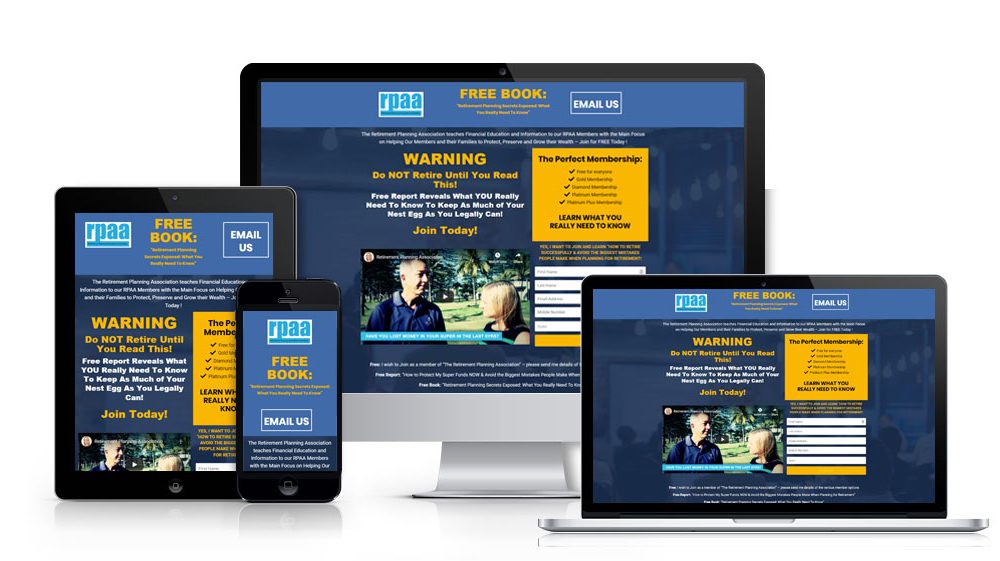
Having a responsive layout allows your website to adapt to any type of screen or operating system, so you don’t have to worry about making an entirely separate mobile version of your site for every different type of device.
Just make sure your image sizes and form fields work on all different platforms. When testing your site, always be sure to view it from several different devices and operating systems, just to be sure.
Recommended Web Design Reference:
By: https://www.dreamhost.com/
By: https://www.makespaceweb.com/
By: https://www.lyfemarketing.com/

