- We take your business to new heights
- support@growmybusinessonline.com.au
Elements of a Mobile-Friendly Web Design

Elements of an Affordable Web Design
September 23, 2020
SEO and Web Design For Traffic and Business Branding
September 28, 2020Here are the checklist of mobile-friendly web design created by wishdesk.com, an expert Web Agency. In this guideline, wishdesk.com shared to us the e-commerce store mobile design guidelines.
What is a mobile-friendly web design?
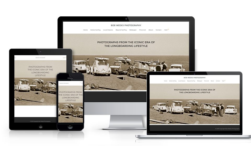
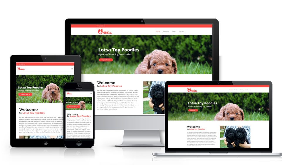
In a broad sense, mobile-friendly website design is one that is comfortably viewed and navigated through on all devices: desktops, tablets, and mobiles.
In e-commerce, this means it is easy to complete all the steps of shopping from product selection to checkout on a mobile device. This includes mobile-friendly forms, buttons, cart, and so on, reflected further in our e-commerce mobile friendly checklist.
How can I check if my website is mobile friendly?
Many customers may think their website is ok, but in reality, it still needs plenty of work. There are online tools to see how your website looks and works from a mobile device and whether or not it is ready to provide a good mobile experience. Among them are Google’s Mobile-Friendly Test, BrowserStack, W3C mobileOK Checker, HubSpot’s Marketing Grader, Google’s PageSpeed Insights, and more.

How to make a website mobile friendly?
In mobile-friendly website development, there are two most common approaches: responsive web design and a mobile website version of your e-commerce store. The first option has more benefits and is more recommended today.
In any case, whichever implementation of website design for mobile you choose here is the comprehensive checklist based on the mobile-friendly design principles in e-commerce.
On the other hand, mobile-friendly web design in Manly is also a factor for search engine ranking which is needed to be given attention by your SEO Agency. Grow My Business offers an affordable SEO for small business
Mobile-friendly checklist for an e-commerce store design
General e-commerce store mobile design guidelines
- Provide instant scrolling to the top the page
- Add a clickable logo through all the website pages
- Ensure the right size of all clickable design elements
- Use your brand colours in all design elements
- Take care of the readable text
- Provide enough space between the layout blocks
- Avoid annoying pop-ups
- Add your brand’s unique favicon
- On every page, it should be clear the user is in your e-commerce store (thanks to the header and design)
- Enrich your online store pages with optimized product images
- Add a clear CTA to every page needs to buy a product and order a call
- Make the shopping cart, search feature, and contacts available from every page
- Provide the product view history on all pages
- Make sure your e-commerce store is well tested against bugs and errors
Mobile e-commerce page layout design
- Place the shopping cart in the top right corner
- Place the sign-in/ sign-up option in the top right corner
- Place the company’s logo in the top left corner
- Place the search feature at the top
- Place the language switcher in the header
Mobile-friendly search on your e-commerce store
- Provide your online store with a search feature
- The search bar needs a fixed place on all pages
- Add a placeholder to your search bar (like “Your search here”)
- Make the search bar easy to clear by clicking “X”
- Allow searching for misspelled words
- Make the search independent from the word form (like plural or singular)
- Use search suggestions
- Allow users to search by synonyms that lead to the same product
- Help users track their search history
- Display the number of results found
- Offer other options or invite users to use advanced search when the product is not found
Mobile-friendly e-commerce navigation design
- Provide the main navigation menu with key product categories and subcategories
- Keep the number of primary menu items to a minimum
- Make it clear how to open the menu
- Make it clear how to close the menu
- Use product icons to enhance the category names
- Underline the category the user is currently in
- Provide your online store with breadcrumbs, including categories and subcategories
Mobile-friendly buttons in the e-commerce
- Ensure the buttons are large enough to click with fingers
- Use optimal spacing between the buttons
- Provide buttons with high contrast and noticeable colours
- At the same time, avoid button colours that are too bright
- Make sure the button design is consistent with your overall brand guidelines
- Provide buttons with clear labels that describe their actions
- Visually enhance the meaning of buttons with icons
- Provide feedback to actions (animation effects, change-state labels, change of colour, sound, etc. to indicate that the action is made right)
- Place the buttons where users can easily find them in the UI
- Position the buttons in a logical order that reflects the user’s path
- Show the priority of buttons so the most important one is the most noticeable
- Avoid using too many buttons so users don’t get confused
Mobile-friendly forms (sign-up and checkout)
- Keep the forms simple and keep the number of form fields to the minimum
- Allow the one-click guest checkout option
- Allow the option to sign-in via social media accounts
- Display password requirements beforehand
- Allow users to turn password typing visibility on and off
- Add semi-automated payment options like PayPal or Amazon Pay that are quick to complete
- Equip the forms with descriptive labels
- Provide the appropriate keyboard depending on the textual or numeric input
- Use the autocorrect feature
- Use the autocomplete feature
- Add placeholders to show how the necessary data should look
- Provide helpful context (e.g. days of the week during date scheduling)
- Use simpler fields (e.g. one “full name” field instead of two “first name” and “last name” fields)
- Explain why you need some specific information (a summary box or a notification)
- Automatically raise the completed fields up the screen
- Provide progress indicators to show how many steps are left
- Show the state of success for the completed steps in the progress indicator
- Use top-aligned form labels and fields
- Try using collapsible menus and dropdown lists in forms
- Make the “submit” button in the form stand out
- Mark wrong and right input with colours, graphic, labels, etc.
- Provide each particular field with feedback for errors
- Take care of instant form input validation
- Use a single-column layout
- Provide the colors, contrasts, and fonts in the form that make it easy to read
- Help the users feel safe by showing a message that their address or phone will be kept confidential
- Make sure the forms load fast
Mobile-friendly photos and videos
- Be sure to offer optimized images
- Give users the option to play or stop a slideshow
- Don’t automatically play videos
- Provide image zooming by pinching and double-tapping
Mobile-friendly e-commerce product pages
- Ensure all the product pages have a uniform look
- Use the same measuring units
- Include both brief and more detailed versions of information
Mobile-friendly e-commerce product categories
- Display the optimal number of products per page
- Allow users to choose the number of displayed items
- Hide the empty categories
Mobile-friendly product filtering and sorting
- Make sure the filtering options are at the top of the page
- Avoid page updates before the users has applied all filters
- Display the number of items next to each filter criteria
- Make sure the filters are easy to clear and the page returns to its previous look
- Show the active filters used in the results
- Create sliders to select the price range
Mobile-friendly shopping cart
- Show all products with photos, attributes like size etc., and prices in the cart
- Provide dynamic indications when the product is added to the cart
- Show a pop-up with the selected products and their cost when something is added to the cart
- Avoid automatic redirects to the cart when the product is added
- Be sure to check the “mobile-friendly buttons” part in your cart design
- Display the number of products in the cart icon
Mobile-friendly contacts in your e-commerce store
- Place your contacts in the header or footer
- Make the contact details copyable
- Offer the option to make a phone call directly from the number
- Make sure clicking on the email address opens form to send a message
- The contact form is available to everyone without registration
- When sent, the contact form shows the appropriate notification
- Create the online support icon that does not obstruct the viewing of content
Security seals in e-commerce
- Use lock icons with a “learn more” option to tell users you offer safe shopping
- The size of the lock icons should be big
- Use the word “secure” throughout your store, especially on the checkout pages
- Rely on the proven cybersecurity providers’ seals like Norton Secured or McAfee Secure
- Integrate with trusted payment providers and display their logos
Affordable Web Design For Small Business
Your website is a chance to present your brand in the best possible way. It’s also the first impression that most potential customers will have of your business.
With over 10 years of experience, you can trust us to deliver a high-quality and affordable business website, which has been custom-built to suit your needs.
Using the following essential features will ensure your site builds trust, and drive leads and sales.
Digital Marketing Services:


